Pick of the shows – walking New York’s galleries
Is it the seduction of scale, the sheer volume that whips up an energy or, perhaps, it is that these shows are simply in New York. Catching 48 exhibitions across three days of “gallery hopping”, one’s ability to filter and “see” with any clarity is certainly tested in this art epicentre – where the business of art challenges the most earnest of critics.
Is the quality of work that different? And what floated to the surface? These were my picks for that October week:
1. Marcel Dzama at David Zwirner (Chelsea)
Love Marcel Dzama. I want to say it again. Love Marcel Dzama. Split across two galleries and two screening spaces, the presentation of this new body of work was ‘inspired by the Nigerian mythological god Edshu, recognizable by his hat that was coloured red on one side and blue on the other, provoking confusion and argument amongst (people) who would disagree on the colour he was wearing’, explained the gallery’s statement. To the left we have a narrative in blue across drawing, sculptures and dioramas; and to the right red.
Similarly Dzama’s latest film, Une danse des bouffons (A jester’s dance) is screened with a red and blue filter at grand proportions. Described as a “Dadaist love story”, it is Dzama’s fictionalised account of Marcel Duchamp’s romance with Brazilian sculptor Maria Martins, recreating Duchamp’s last major work Etant donnes (for which Martins was his model) the heroine and trickster play out a game of chess. It is fabulously bewitching, weird and wondrous.
Between the galleries was a stacked bank of video monitors screening simultaneously Death Disco Dance, where dancers in black and white polk-dotted unitards move together in a short loop. As with these costumes, and those of Dzama’s dual screen filmic piece, references to theatre, dance and visual art history is not lost, from Joseph Beuys to Oskar Schlemmer, Francis Picabia, to Marcel Duchamp – the gallery reminds us appropriation is a form of collaboration in Dzama’s hands.
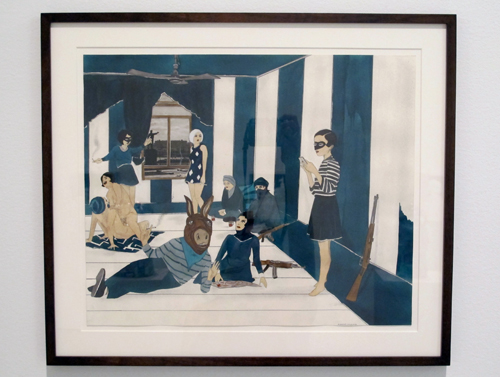
I first had the pleasure of being introduced to Dzama’s work when I was working at Haines Gallery San Francisco. More than a decade on I am as excited by his work today; oblique, irreverent, perverse, dark, sinister, playful, humorous, narrative … so little art today offers such a journey. Dzama said in an interview: “I feel like I grew up with a lot of these characters in Winnipeg (Canada) and they tend to pop up in old film noir too.” There is an element of freak-show nostalgia about Dzama’s work. Are we all just secretly perverse voyeurs? Clearly, many of us are… this exhibition has sold well.
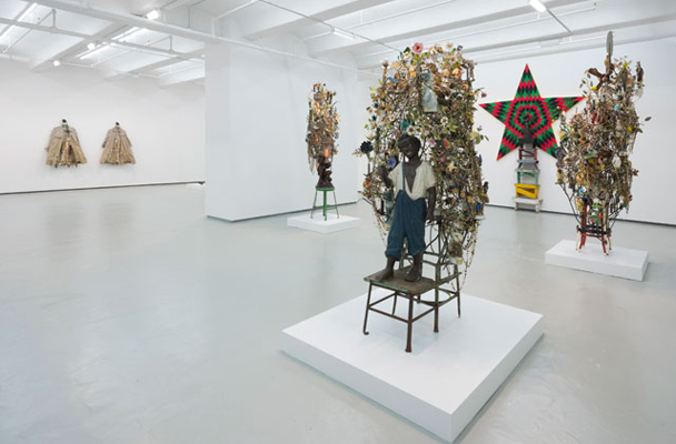
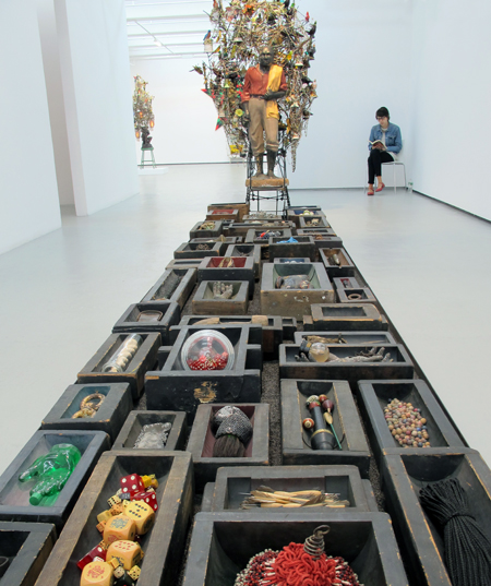
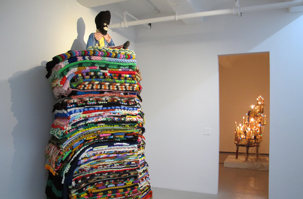
2. Nick Cave at Jack Shainman (Chelsea)
Across two galleries Made by Whites for Whites is the stronger of the two shows, while Rescue, with its near life-size pooches sitting on furniture within elaborate grottos, seemed not too move as succinctly beyond the world of kitsch. It leaves one asking is it the dogs or the curios – the kind of Victoriana tchotchkes your aunt or grandmother might have prized – that have been “rescued”? Both play off the notion of the “untouchable”.
Installation view Rescue, Jack Shainman Gallery, October 2014
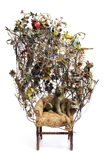
Made by Whites for Whites has a more sinister tone. Again, Cave’s lexicon of ceramic birds, fruit and figurines reek of colonialist zeal, this time enveloping stereotypical representations of “the black man” – from golliwog to dandy. Cave reminds us that all objects are loaded.
Installation view Made by Whites for Whites, Jack Shainman Gallery, October 2014
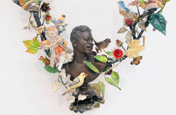
It is a visually luscious exhibition while provocatively challenging the viewer’s reading of these objects, seemingly banal and celebratory in their own way. “I began thinking more about myself as an artist with a civic responsibility,” said artist Nick Cave to Mass MoCA curator Denise Markonish during a conversation at Jack Shainman Gallery. Mass MoCA will show a football field sized installation of Cave’s work next year.
Seeing these shows back-to-back – and they are in themselves incredibly collectable objects – the flutter between obsession, rarity and desire is inescapable. There were a clear standout across New York’s October shows.
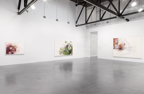
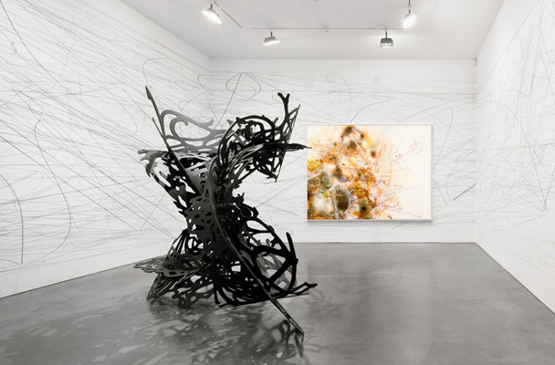
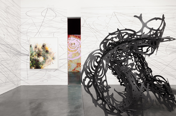
3. Matthew Ritchie at Andrea Rosen Gallery (Chelsea)
Matthew Ritchie knows this gallery space and you can tell – the way he uses it, extends it, ushers the viewer through it – his work superbly in sync with the architecture. It is his fifth exhibition with the gallery and it brings together four distinct projects: an immersive video work, wall drawing, sculpture and painting. It has been aptly described as a layered ecosystem of sorts, the ten paintings offering graphic, spatial and gestural links to the other three works. It is a massive web of information, where abstraction fall just short of the equation. And, should you choose to try to decode or digest it, one can with the assistance of a source or guidebook, or you happily get lost in its immersive “hypnostatic abstraction” – great term isn’t it. Read more
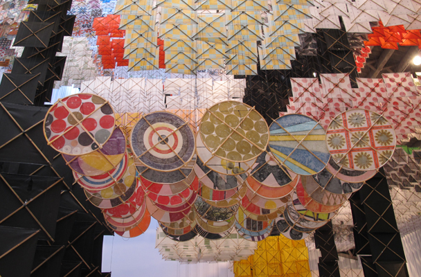
4. Jacob Hashimoto at Mary Boone (Chelsea)
When you first enter the gallery this work is masked from view; then the delight of its presence hits you, floating inverted from the gallery ceiling, gently fluttering from the air con and movement of people, it washes over you with such joy.
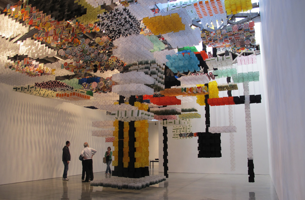
Brightly colour patterned paper baffles build row-upon-row a “fortress” which guards a pristine layer of white “cloud-like” kites at the ceiling. Hashimoto has titled it Skyfarm Fortress, and it is the first large scale site specific work of his to be shown in NY.
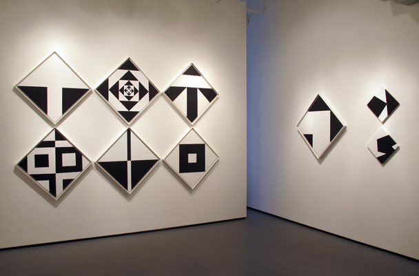
5. Ward Jackson at Minus Space (DUMBO)
These paintings are as fresh and rigorous as the day they were made. Focusing on Jackson’s black and white diamond-formatted canvases from the 1960s, this is a superbly presented and researched exhibition. I had not heard of this artist and, as the dealer explained his phenomenonal past one could only ask – how does such an artist slip from focus? Jackson’s black and white diamond paintings were first shown at the Kaymar Gallery (NYC) in 1964, organised by Dan Flavin who ‘brought together for the first time artists identified with the emerging Minimalism movement, what critic Brian O’Doherty of The New York Times termed “the avant-garde deadpans”. The exhibition featured Jackson’s work alongside artists Jo Baer, Dan Flavin, Donald Judd, Sol LeWitt, Larry Poons, Robert Ryman, Frank Stella and others,’ explained the gallery’s roomsheet. While the company carries gravitas, this exhibition does it all by itself. It is a fabulous example of the shows that you can find in NY outside the muscle of the Chelsea set.
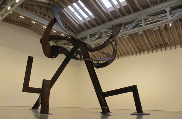
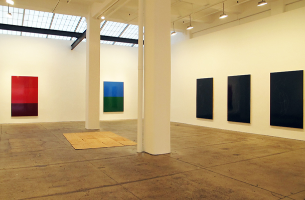
6. Mark di Suvero at Paula Cooper Gallery (Chelsea)
This is what these New York spaces are all about – scale, prestige, extravagance. A single ENORMOUS sculpture by di Suvero flirts with the architecture challenging its very physicality and perplexing any viewer – how the hell did they get it in? Titled Luney Breakout, rusted hard-edge I-beams boldly soar, holding crescent-like discs some 22-feet in the air that seemingly defy gravity. It is playful, majestic and downright magnificent. It is accompanied by a painting from 1995 and one painted this year.
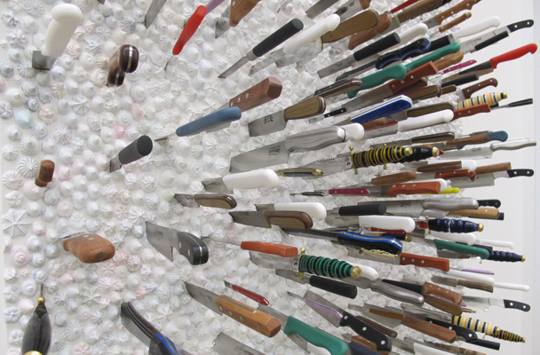
7. Farhad Moshiri at Galerie Perrotin (Uptown)
This was Moshiri’s first show in New York and it was a killer – perhaps a description a little too literal with all those flung knives (top image) in faux whipped butter and frosting. I was first introduced to the Iranian-born Moshiri’s work at an APT in Brisbane, and this exhibition marks a significant development.
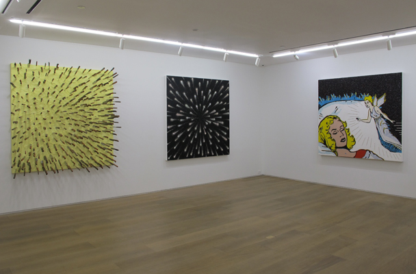
Titled Float, it sits somewhere between the slightly out of whack narratives typical of Boy’s Own Annual and bejeweled astral-scapes of shooting stars. Moshiri’s ease at subverting the idioms of contemporary society offers a suspension of reality or a parallel dimension – simply, he is a collector of extremes both familiar and freaky. Do the pairings make sense; what do we read from this show? For me there is a banality to the content that leaves the work firmly in the zone of its materiality – not a bad thing, especially when done so well.
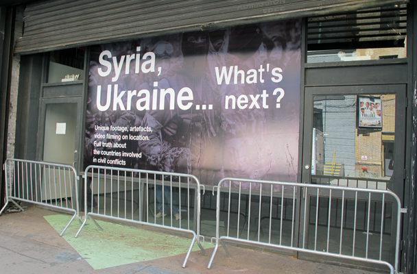
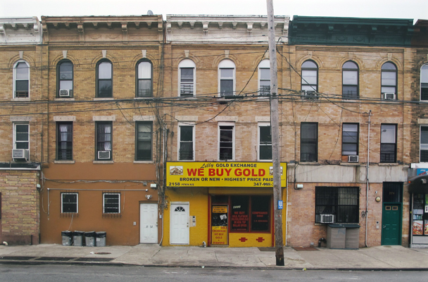
8. Syria (pop up in Chelsea)
I walked into this exhibition, moving through with – to use a Bushism “shock and awe” – before the weight of what I was seeing being press-styled images sunk in. These images of conflict are paired with objects rescued from the scene – the ultimate document of time and place.
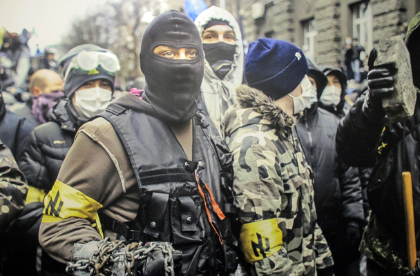
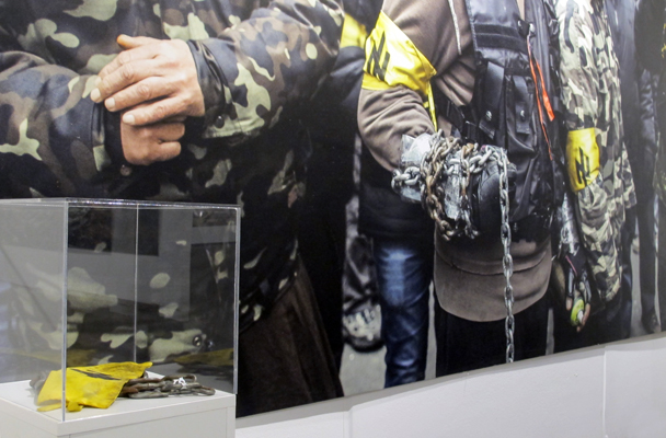
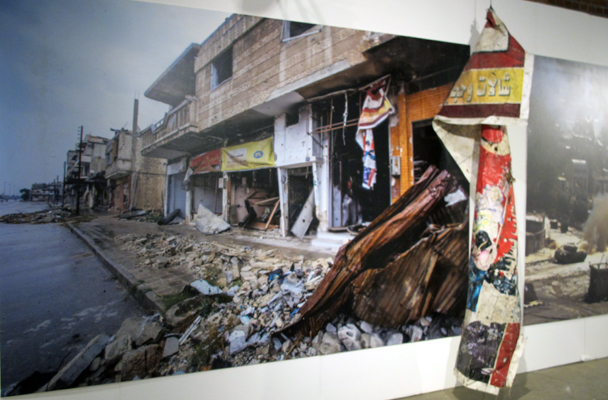
What’s next? The exhibition did not purport a political position, or indeed answer the question it proposed. It was however and emphatic advertisement for peace.
9. Ronald Ventura at Tyler Rollins
Titled E.R (Endless Resurrection) – there is something in the word ‘endless’ here – this topic has been done to death. It uses Holy Week reenactments of Christ’s crucifixion and devotee flagellation, most typically in Pampanga province in the Philippines, as a kind of cntemporary art pawn. While it might come across as exotic and a collision of worlds to a New York audience, in a Filipino context Ventura is treading stale ground – and one might even be so cynical to suggest “trading on” context. That said, you can’t discredit Ventura’s skill and ability to construct an image. Like so many Filipino artists, he is an amazing technician. More so, Ventura presents a conceptually tight and considered exhibition – and this one delivers superbly yet again.
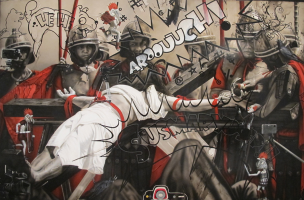
Anchored by a large sculpture, the paintings are also off-set by a slide show (first I have seen for Ventura), where the artist had printed a mock-up of Caravaggio’s Flagellation of Christ and placed it along the processional route; the soundtrack that of penitents whipping themselves. Powerful – yes; worth a look – definitely; pushing new ground – hardly.
10. Kate Shepherd at Galerie Le Long (Chelsea)
Shepherd’s show is pristine; her surfaces mirror-like, the floor and wall pieces superbly in conversation with the cracks of the aged concrete. These paintings flirt between figuration and hard-edge abstraction. Shepherd has long used 3D modeling software, starting in SketchUp to build the virtual nude model (below) or gaming figures, mutating and distilling the original source material to the point of abstraction.
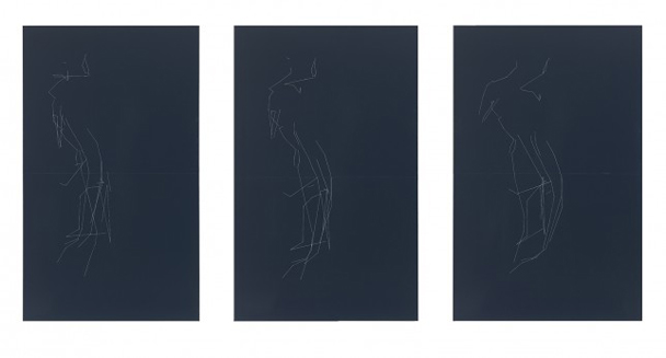
Whispy, thread-like tendrils sketch forms that dwell on the luscious enamel surface. Impossible to photograph, you are caught in their reflections. Furthermore, Shepherd plays with the modernist division, working in two panels often defined by colour.
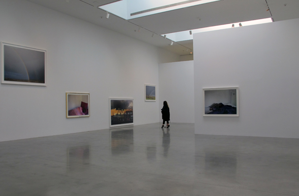
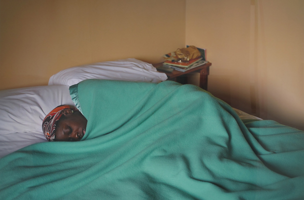
11. Paul Graham at Pace (Chelsea)
While I surprise myself for including this show, I have as it is superbly conceived and delivered. Paul Graham’s Does Yellow Run Forever? is a whimsical, dark, yet optimistic slice across human values – love, wealth, happiness, beauty – as he puts it, the stuff of rainbows. Hung peppering the walls in a random arrangement are juxtapositions of photographs of rainbows from Western Ireland (seemingly floating towards the gallery’s ceiling), a sleeping dreamer in various rooms, and pawn shop signage that promises gold, presented “down-at-heel” at the kick zone. These photographs were taken over a three year period.
12. Agnes Martin in a collection hang at the Whitney (Uptown)
While five floors of the Whitney have been turned over to Jeff Koons’ survey, easily missed on the top floor is a collection hang. Among the star-studded line up is a room of Agnes Martin The Islands (1979). The label accompanying this suite of paintings quotes Martin: “Everything is about feeling”. Walking into this space – especially after Koons – it is truly palpable.
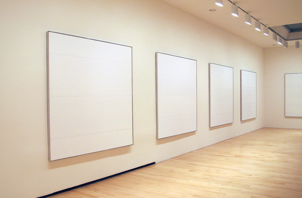
The Islands were painted at a point in Martin’s abandoned the grid paintings of her early career, embracing horizontal compositions defined by bands of graphite lines. Like all quiet work, the reveal is slow and deeply rewarding.
Unconvinced but not quite ready to dismiss…
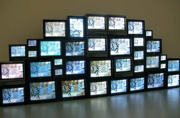
1. Nam Jun Paik at Asia Society (Uptown)
The flaw of this exhibition is that it is over didactic – I can’t believe I am saying that, afterall, it is my job to champion access to work. The exhibition design feels antiquated and, if anything, suffocates the work. Did they use an exhibition designer? There are some stella pieces, from Paik’s first Robot K-456 to his work with Charlotte Moorman, his Family of Robot series of 1964 , Golden Buddha (2005) and pictured below, his Reclining Buddha (1994/2002).
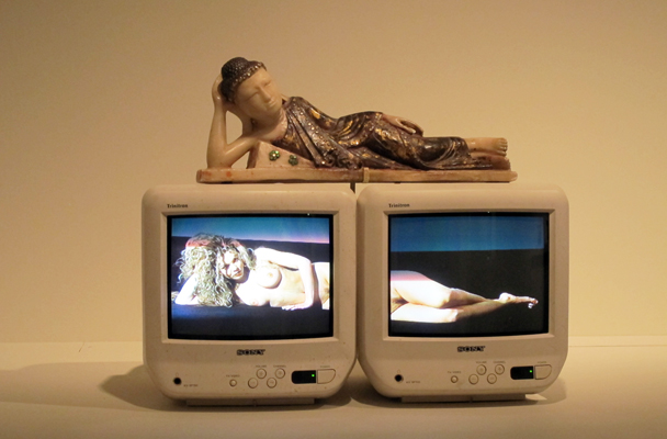
It is a fabulously researched exhibition and a timeline that sites Paik’s milestones along more broader developments within the tech world, reiterate just how brilliant Nam Jun Paik was, ahead of his time. It is a shame the presentation of this exhibition didn’t echo that same innovation.
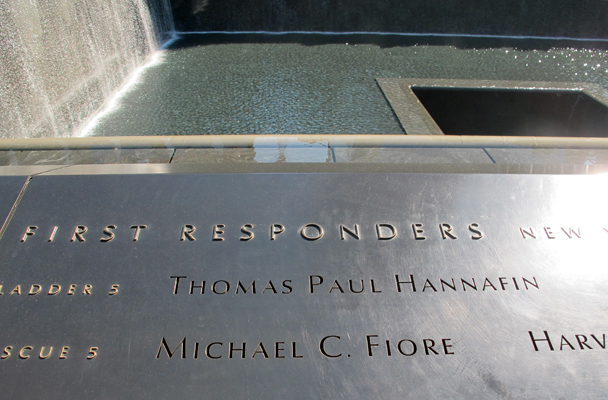
2. 911 Museum (Downtown)
Dare one speak out about this bastion of patriotism with a negative tone? Entering the museum visitors are funneled down through dimly lit spaces, sensorialy rich with oral history, text fragments and individual objects that sit as poetic reminders, allowing each to bring their own memory to this narrative. The journey down is symbolic, and one’s reading of scale and space is a slow realisation. My hopes were high for the museum’s handling of the topic.
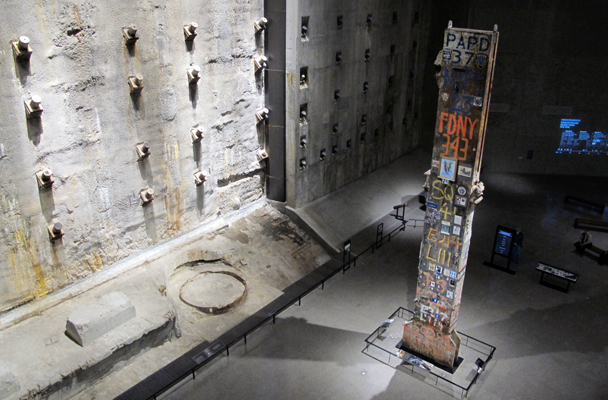
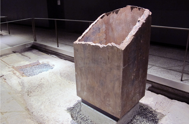
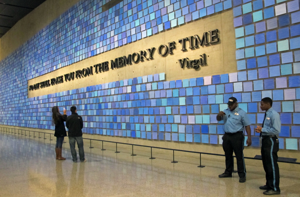
Moving another level lower, a huge wall work stretching tiles of blue – each a unique colour standing in for the memory of the colour of the sky remembered on that day, a quote by Roman poet Virgil embedded with the blue field – “No day shall erase you from the memory of time”. One then moves through fragments: The survivors staircase; Ladder company 3 fire truck, sheared metal columns and so on. Still, it was delivered without the propaganda pummel.
Off to a side was a theatrette screening Reflected on 9/11, a cross section of people answering the question: “Do you think we can end the war on terror?” with the opportunity to join the conversation in recording booths. The skeptical seeds had been sewn.
I went into the next “Memorial” exhibition, where the tone changed; poetics left at the door. The first third was about recounting the event – a rigorous timeline of oral histories and objects; the second third was about demonising the terrorists (tracking and trialing); and the third section had whipped up into flag-flying propaganda – championing collective memory. It managed to turn a moment of America’s vulnerability into US strength.
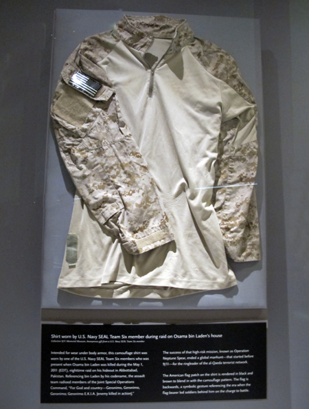
And, should I have been forgiving, all hopes were dashed when I exited to find in a glass vitrine one of the army seal’s jackets worn during the capture of Bin Laden. Do I need to say anymore? To my taste, the memory pools of cascading water upstairs in the plaza and the symbolic journey down punctuated with a few key objects said it so eloquently.
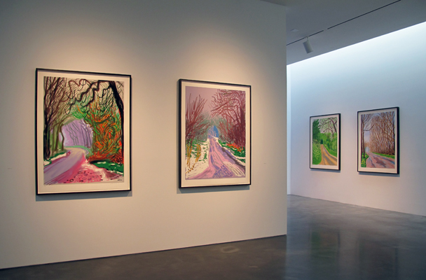
3. David Hockney at PACE (Chelsea)
How many times has Hockney reinvented himself? Walking into the gallery you are faced with a massive didactic wall text and a suite of black and white drawing, which is then punctuated with this multi-channel video to a room of new ipad drawings. All are impressions of a Yorkshire landscape transforming into spring – a landscape that Hockney grew up in and returned to in 1999 after years living in LA.

The video was filmed with nine cameras attached to a SUV. Hockney’s interest began the same year that he bought his first ipad, 2010, and his entree into making ipad drawings. This suite shown, printed on paper and titled The Arrival of Spring in Woldgate, East Yorkshire in 2011, was made between 1 January and 31 May that year. Hockney explained: “These were drawn knowing they would be printed a certain size. The mark making is very varied for this reason.” What struck me most was not the gesture or mark but the colour – its acidic vibrancy which suspends belief, reality – not unlike the virtual world. I am not sure whether I would call it “great art”, but it is an fascinating exploration of drawing in our times.
4. Jenny Holtzer at Cheim and Reid (Chelsea)
This exhibition is all over the place. Sure Holtzer has used government documents as source material since 2004, but these Dust Paintings have lost their balance; muddy beyond metaphor. While they continue her interest in tracing the wreckage and fallout in the global war on terror – more specifically in these paintings the case of Jamal Naseer’s death (through torture) whilst in custody – Holtzer’s “fog of war” blurbs with Arabic calligraphy traditions. Really? They just look poorly painted to me.
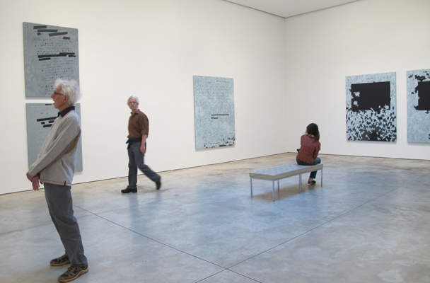

More interesting – however sitting with the clash of a car crash with the dust works – are a suite of paintings that recall Suprematists or Colour Field painting. Based on heavily redacted CIA and FBI reports, the once blocked out texts become fields of colour. What escapes redaction? What captures our eye? Sadly, this exhibition follows the path of many artists today to weight the work down with “meaning”, where painter is reduced to merely a delivery device. The gallery sheets states: ‘History makes a violent return to art history.” I am not convinced. Perhaps I would be more forgiving if Holtzer focused on just the one body of work. By throwing them together, she comes off as overwhelmed by the material, grabbing a straws to express it – or extend that dialogue beyond its use-by date within her oeuvre.
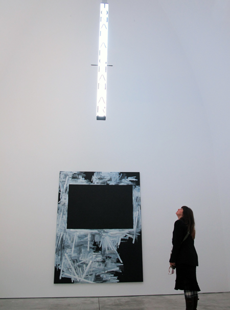
A kinetic LED text work adds to the mash in another space.
5. Kwang Young Chun at Hasted Kraeutler (Chelsea)
Kwang Young Chun turns 70 this year and, clearly if this show is any example, he is celebrating with colour. Renowned for his black and white constructed canvases of folded mulberry paper with text, his Aggregation series begun in the 1990s. The artist continues his waves of triangular forms, however, there is a significant deviation. Red and yellow fields pop, the colour stain evocative of fields of flowers or earthly textures. Of note is a blue concave work which owes a little too much to Anish Kapoor. I am really split on this exhibition. The colour feels too saturated; slightly unresolved. Is that because we are just so used to his black and white vernacular? Should we be so quick to dismiss change when an artist is so locked by style? He remains true to his vision and voice and, as always, the work is superbly constructed and presented.
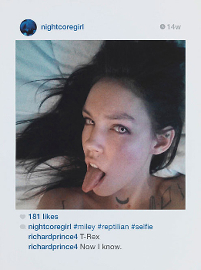
6. Richard Prince at Gagosian (Uptown)
Titled New Portraits, American legend Richard Prince has taken to Instagram pumping up others’ posted images to steroid proportions (inkjet on canvas each measuring around 6 x 4 ft). Fittingly they are in Gagosian’s Madison Ave bookstore gallery, all 37 of them baring a hefty pricetag. It is an interesting choice given Prince has just come off the back of Rasta paintings copyright infringement case. Is he still “stealing” images without permission? One could argue he always has – his reputation forged on appropriated advertising images.
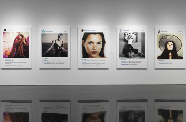
Prince is interested in the way people present themselves – and their social group – to the world. Is it just old fashioned voyeurism updated? Jerry Saltz in his review of the show admits: “I spent last year wishing he would do me.” Prince trawls Instagram with a level of perversion, selects an image, comments using his own name, makes a screen-grab and then emails to his studio assistants to “produce” it into the “artworks” here. It is a curious blur between reality and constructed reality on every level.
Leave a Reply
You must be logged in to post a comment.